In what ways does your media product use, develop or challenge forms and conventions of real media products?
For our thriller opening, we wanted to take the idea of a chase, which would hook the audience, and twist it to fit it into our sub genre of psychological thriller. We took the idea of a chase from films such as ‘Vertigo’ and ‘Lock Stock and Two Smoking Barrels’ which we watched as part of our thriller research. The chase is a classic thriller signifier, especially at the opening of the film as it immediately creates mystery and intrigue and always makes the audience wonder what will happen next. It also creates a fast pace to the film. To create the setting for our chase, we based our thriller in a vast open space instead of a city to create the mystery of what the character could be running away from. To challenge the genre conventions, we also used a female to play the main role, as they do in films such as ‘Kill Bill’ and ‘Jackie Brown’. However, we did stick to certain thriller conventions such as the weather being stormy and rainy. This interlocks with the idea that the weather represents how our character feels inside; the rain and stormy weather shows that she is upset, confused and frustrated.
With our thriller film, we wanted to move away from the idea of classic ‘gangster’ thrillers and move more towards the idea of a psychological twist. To achieve this effect, we knew we would have to come up with a story line which featured fewer issues about the stereotypical thriller ideas such as drugs and violence and instead, include more about how the mind works, and the way that people interact with each other such as in the ‘The Machinist’. We wanted to give the audience something to think about instead of letting them watch simple actions occurring on the screen which is a technique often used in the mainstream thriller films. If a film makes you think, you are more likely to remember it, which is often what makes a successful film. We were aware that the thriller opening had to be thrilling and intriguing so we created a scene which would puzzle the viewers in a way which would let them form their own ideas about what was actually taking place, and they would therefore want to continue watching, to see if their assumptions were correct.
We used a long shot of a plane flying past to show that 'Grace' was being searched for, we managed to do this because the location we filmed in had planes frequently flying past. During audience feedback, some audience members commeted on the fact that they did not quite understand this shot and thought it was irrelevant to the plot. However, we felt it was revelant to show that it was important for 'Grace' to be found so we decided not to take this section of footage out.
How does your media product represent particular social groups?
Our film focused on the feelings of a young girl who had escaped from a mental institution. This is hard to relate to a social group as people of her mentality are often hidden from society. We decided not to make it perfectly clear that the girl had escaped from a mental home, but instead gave subtle hints, such as her costume of white clothes to show what she had been wearing at the time of escaping and showing a short clip of a plane passing through the sky, searching for her to suggest that it is of vast importance that she is found. We hoped to show to the audience that they could relate to the character in the way that she is a person and has feelings just as everybody else does, even if she does not think in the same way as them. We wanted to get across to the audience that the mental institution would not have recognised her as a person, but as just another patient. The white clothing was a visual element which we used to show how Grace stands apart from society and would not simply fit into a normal community because she is not accepted.
We created the character ‘Grace’ in the hope that the audience would see her as a strong enough character to be the main protagonist of the film. We ignored the thriller idea of the classic ‘Femme Fatale’ and instead gave her the slightly run down image, so she would not, at first glance, appear desirable. We did this so we could focus on her strong characteristics instead of the way she looks, as women are often only recognised for the way they look in thrillers.
What kind of media institution might distribute your media product and why?
Our thriller would probably be distributed as an ‘arthouse film’. This is due to the fact that it has a very specific target audience, appealing mainly to woman aged from 15 – 30 due to the gender and young age of the main protagonist and would probably not be thought of as a film which would appeal so much to mainstream cinema goers. It would be shown in cinemas such as ‘Cinema City’ and may be shown several time in mainstream cinemas such as ‘Vue’ and ‘The Odeon’. A distributor who was looking for arty, slightly unusual films would want to distribute out thriller.
Who would be the audience for your media product?
As mentioned in my audience profile (part of method 2), the age demographic for our thriller would be 15 – 30. This is because the character is 17 years old and the younger audience members would be able to relate to her more than the older audience members. Female audience members would definitely be drawn to the film as, even in contemporary thrillers; it is quite rare to see a female main protagonist. Due to the age demographic, audience members are likely to be at sixth form, college, university or aspiring to go to university, as was revealed in a questionnaire we took. Audience members who take an interest in music and/or photography may be interested in our thriller as it contains many well thought out shots in which the Mise en scene was focused on until perfected.
How did you attract/address your audience?
As with films such as ‘Kill Bill’ and ‘Jackie Brown’, our main character is female. We decided to apply this slightly unusual aspect to our thriller because we felt that the audience would be able to get a better understanding of the character’s feeling, thoughts and reasons for actions if the character was female, as this gender (mostly) is able to display their feelings more than males do.
So as not to discourage male audience members viewing our film, we used an attractive girl to play the character of Grace, but she was not portrayed in a way which would seem fake or too ‘made-up’. This was done to keep the interest of the male audience in a way which would still let them focus on the storyline instead of focusing on the way the character looks.
What have you learnt about technologies from the process of constructing this product?
I have learnt how much work and concentration goes into making a thriller opening despite whether it ends up successful or not. I now know that it takes a huge amount of planning and dedication to continue working on the film until you have finally got it exactly how you want it and how you think the audience will want it. We needed to plan the exact dates and times of shooting, dates of meeting schedules, and each and every prop that needed to be taken to each shooting date. We were able to make use of our basic filming skills and to develop them into more advanced skills that managed to portray how we wanted our film to look. I have learnt how to use ‘Adobe premier Elements 1.0’ to edit our thriller successfully in a way that is satisfactory. My knowledge of how to use this editing software grew as we went on making the thriller opening. I now know how to upload our footage onto the programme, how to cut up each section and rearrange it to achieve the desired effect, how to slow down and speed up sections of footage which really helped with the section where ‘Grace’ fell. We had to slow down this section to make it obvious to the audience that she had fallen and injured herself. We learnt how to apply effects to the transactions of different clips. In particular, we applied the fade in effect when the camera circled Grace as she looked around for a place to run to show her confusion. Each time we showed a different clip with this fade in effect, we also slightly darkened the clip to show that time had passed and that the sky was getting darker.
We were not confident in using this programme at the start of the year as it would have been too difficult for teachers to show us how to use each and every effect. We had to experiment with certain effects which worked well, and we would have had to do this even if we had known how to use the programme, to check what looked good.
Looking back at the preliminary task, what do you feel you have learnt in the progression from it to the full product?
During the preliminary task, my group worked on grasping the simple techniques that we knew we would need when making our thriller opening. We used the tripod to hold the camera still whilst filming long shots and to keep the camera still when we needed a steady shot. Before we were given the time in the preliminary task to practise these skills, we were unsure of how to even attach the camera to the tripod. We learnt continuity skills which was extremely helpful as none of the thriller openings would have made sense if the actions of the characters did not match up. We had to work hard in editing the thriller to make sure that everything ran smoothly. In some instances, this was not necessary as we would cut to a completely different clip and it was obvious to the audience that time had passed between the two clips, and that the character had travelled to a different place.
Wednesday, 4 March 2009
Monday, 2 March 2009
MORE SHOTS


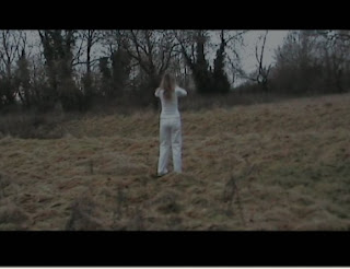
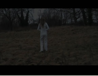
We used several shots in this scene to create a sense that time had passed between each shot. We made the shots fade into each other, and the lighting became darker in each one showing that the character had been standing, looking around for a long period of time. We think this idea worked well as it gives the clear impression of her time running out and the audience become aware that as soon as it gets very dark, Grace will be in an even worse situation.
We felt that the location of our thriller worked well with the issues we were trying to portray. The large outdoor spaces created a feeling of loneliness and managed to represent how the character felt in her mind. The trees looked eerie and spiderlike as they had no leaves on and let the audience understand the characters fear of her surroundings. The surrounding contrasted greatly with the character, Grace, as she wore white clothes and seemed very innocent compared to the cruel looking background.
The colour theme of our thriller was blue, to show the coldness of the issues that we were putting forward. This colour best represented how there was absolutely no warmth or happiness in the situation that took place in the thriller opening. The colour also represented what life inside the institution would have been like; dull, cold and colourless.
Thursday, 26 February 2009
SHOTS
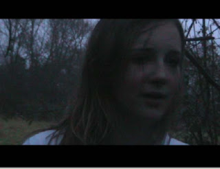
 This is the opening shot of our thriller films. We faded this shot in from a black screen to make it almost seem as if the character has just opened her eyes and somehow found herself in the position she’s in, in the middle of a strange and unfamiliar field. Her hair is wet and her face is red and dirty, suggesting that she has been running for a long time and that it was raining. We decided to shoot this scene when it was raining, as heavy rain is a classic thriller signifier and it added to the desperation of the character’s escape. We were pleased with this shot as it turned out exactly how we had first pictured it, it creates mystery and intrigue. The Mise en scene turned out just right; the shot always included the leafless trees with tangled branches behind the character which connotes that a lot of confusion is going on within the character’s mind. The sky was white/blue which worked in the same way as the character’s outfit does and also shows the coldness of her journey.
 This shot showed the character running away into a vanishing point to show that she does not know where she’s going, or where she’ll end up. We decided to make the font of the credits In ‘Courier New’ as it created a clinical look, as if it was the font they use to print onto the sheets which display patient’s illnesses. We chose for the titles to be white so they stood out from the surrounding and fitted in with what the character is wearing to show that she belongs where the writing belongs; in the mental hospital.
Wednesday, 11 February 2009
Thursday, 5 February 2009
Continuity Task
We decided to film our continuity task in the girl's toilets at school. We thought of a simple storyline in order to make the clip more interesting to watch.
For the first shot, we used a close up of high heeled shoes, using a tri-pod to keep the shot steady and tilting the camera down so we could get the shoes in the shot whilst the character was walking down the hallway. We then filmed a shot of the long corridor, which ends in a vanishing point, with the actor right at the end. She begins to walk towards the camera, we then cut to the same girl but she is now halfway down the corridor. She walks for a couple of seconds then we cut again to the girl even closer to the camera. We do this to show that time has passed and we do not show the actor walking all the way down the corridor in real time, because it would get boring to watch. The camera follows the girl as she turns the corner; we then filmed a shot to show her pushing open the door. This worked well because we managed to get a fluent, realistic shot change.
The next shot was filmed into the mirror. We did this because we could see the girl coming in through the door, which was actually hidden around a corner. We could also see the second girl in what was almost an over the shoulder shot. We then show a shot as if the camera is the mirror. We propped the camera up in the sink. This gave a really interesting shot, especially as the colour of the overall shot seemed blue, and this added to the idea of the camera being a glassy mirror. When the two girls leave the girl’s toilets, the screen is left with a shot of three cubicles. I think this shot is very effective. It is split into the three sections of the separate cubicles and seems oddly empty without the dialogue or action.
Subscribe to:
Comments (Atom)


