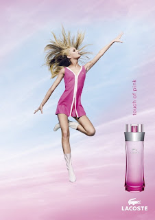
This picture of the advert (right) is slightly different from the one I was analysing.
A blonde woman wearing a short, pink dress and white boots hovers in the sky with her arms out to the side and one leg bent, this gives the impression that she is flying or weightless. The model is staring up into the sky and she has a little smile on her face which gives the idea that she is meant to be somewhere else but is currently right where she wants to be. Her interesting body shape draws the audience’s eye to this advert.
Near the bottom of the page, the clouds behind the model are a pink colour which could be thought of as representing a ‘rose tinted world’; this idea could appeal to many people. On the bottom, right hand corner of the advert, the same colour scheme is shown on the bottle. It starts as dark pink at the bottom and gets lighter at the top just like sky in the background.
The models clothes seem fairly childish as they are simple and they have the feeling of the 60s style as well. This would appeal to the audience because the model’s clothes show that she is carefree and happy and the advert makes them think that by wearing the perfume, they could feel the same. The model’s dress also has the Lacoste logo on it with gives the company a chance to advertise their products even more.
This advert has also thought of men being the target audience; you can very nearly see up the model’s skirt which I think would appeal to men. The advert has to appeal to men as well as women because most of the time, men buy perfume for their partners and by making the model seem fairly exposed, Lacoste have succeeded in getting the men’s attention.
The name and theme of the perfume would especially appeal to women who favour the colour pink. Lacoste may have stereotyped women a bit here because it is not the vast majority of women who would choose pink as their favourite colour, even if it seems like it should be that way.
The name of the perfume ‘Touch of pink’ is displayed just above the perfume bottle. It is the same colour as the models dress, so it immediately draws the readers attention and it is all in lowercase letters, which makes it seems quite fun and shows that there are ‘no rules’. This mixes with the idea of the model seeming like a child, which should appeal to the women audience because it seems like the perfume will free them from their grown-up responsibilities. The bottle is a very simple shape which fits in with the childish them of the advert. The world ‘Lacoste’ is in a larger font and is all in capital letter to show that out of everything in the advert, the word ‘Lacoste’ is the most important.

 Initial Ideas


