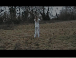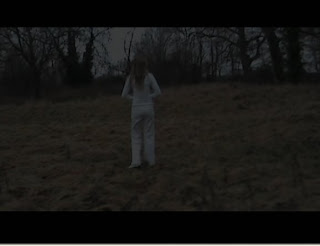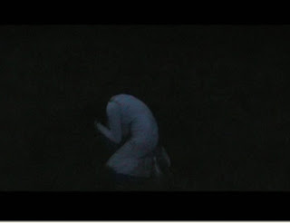


We used several shots in this scene to create a sense that time had passed between each shot. We made the shots fade into each other, and the lighting became darker in each one showing that the character had been standing, looking around for a long period of time. We think this idea worked well as it gives the clear impression of her time running out and the audience become aware that as soon as it gets very dark, Grace will be in an even worse situation.
We felt that the location of our thriller worked well with the issues we were trying to portray. The large outdoor spaces created a feeling of loneliness and managed to represent how the character felt in her mind. The trees looked eerie and spiderlike as they had no leaves on and let the audience understand the characters fear of her surroundings. The surrounding contrasted greatly with the character, Grace, as she wore white clothes and seemed very innocent compared to the cruel looking background.
The colour theme of our thriller was blue, to show the coldness of the issues that we were putting forward. This colour best represented how there was absolutely no warmth or happiness in the situation that took place in the thriller opening. The colour also represented what life inside the institution would have been like; dull, cold and colourless.

No comments:
Post a Comment