Monday, 20 October 2008

Planning of Perfume Advert


Initial Ideas

For my perfume advert, I knew that I wanted the model to be in a tree to show how she was natural and fitted in well with nature. I chose the design on the left for my actual advert because it showed the model to be adventurous aswell as beautiful. The model is looking towards the sky which is used in many adverts. To me, it shows that the model is optimistic about the future. The colour of the dress shows that the model has a bold personality and isn't afraid to stand up for what she wants.

Sunday, 19 October 2008

Analysis of Touch of Pink- Lacoste Perfume Advert

This picture of the advert (right) is slightly different from the one I was analysing.
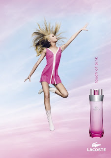
A blonde woman wearing a short, pink dress and white boots hovers in the sky with her arms out to the side and one leg bent, this gives the impression that she is flying or weightless. The model is staring up into the sky and she has a little smile on her face which gives the idea that she is meant to be somewhere else but is currently right where she wants to be. Her interesting body shape draws the audience’s eye to this advert.
Near the bottom of the page, the clouds behind the model are a pink colour which could be thought of as representing a ‘rose tinted world’; this idea could appeal to many people. On the bottom, right hand corner of the advert, the same colour scheme is shown on the bottle. It starts as dark pink at the bottom and gets lighter at the top just like sky in the background.
The models clothes seem fairly childish as they are simple and they have the feeling of the 60s style as well. This would appeal to the audience because the model’s clothes show that she is carefree and happy and the advert makes them think that by wearing the perfume, they could feel the same. The model’s dress also has the Lacoste logo on it with gives the company a chance to advertise their products even more.
This advert has also thought of men being the target audience; you can very nearly see up the model’s skirt which I think would appeal to men. The advert has to appeal to men as well as women because most of the time, men buy perfume for their partners and by making the model seem fairly exposed, Lacoste have succeeded in getting the men’s attention.
The name and theme of the perfume would especially appeal to women who favour the colour pink. Lacoste may have stereotyped women a bit here because it is not the vast majority of women who would choose pink as their favourite colour, even if it seems like it should be that way.
The name of the perfume ‘Touch of pink’ is displayed just above the perfume bottle. It is the same colour as the models dress, so it immediately draws the readers attention and it is all in lowercase letters, which makes it seems quite fun and shows that there are ‘no rules’. This mixes with the idea of the model seeming like a child, which should appeal to the women audience because it seems like the perfume will free them from their grown-up responsibilities. The bottle is a very simple shape which fits in with the childish them of the advert. The world ‘Lacoste’ is in a larger font and is all in capital letter to show that out of everything in the advert, the word ‘Lacoste’ is the most important.

Changing the Meaning


This photo (left) creates a huge sense of mystery. The dark shadows and averted eyeline suggests that something sinister is going on. This is almost a close-up and shows some details on the person's face. The other photo (right) is a birds eye view shot taken from a balcony. It also creates a certain sense of mystery as it is in black and white and the model is using interesting body language. His arms are folded and his face is showing expressions of surprise and also slight humour. The t-shirt and hair are very dark and if the face and arms had been made slightly lighter (using photoshop) the shot would be using chiaroscuro lighting.

Wednesday, 8 October 2008

Perfume Advert Analysis

Charlize Theron is shown wearing a lacy, low cut top or dress and a large gold earring in her right ear. She has one hand placed at the top of the dress and looks as if she is about to pull it off like she ‘can’t contain herself’, while the other hand tugs at her earring.
The advert has a main theme of gold (gold earring, gold eyeliner, golden skin, gold bottle) and the background is fairly dark but shows a blurry chandelier which gives the idea that wealthy people would wear this perfume.
The model’s eyes stare down into the camera and one eyebrow is raised which gives the impression that she knows something that the reader doesn’t and that she is in control. It makes the advert intriguing and mysterious and also makes the viewer want to be just like the model.
This advert also should appeal to men. The model shows a lot of skin and cleavage which automatically draws a man’s attention and makes him think of his own partner in the way he is thinking about the model, which consequently should make him want to buy the perfume for his partner.
The bottle of perfume is placed in the bottom, right hand corner of the advert. It is large and gold which makes it look very expensive and grand. ‘Sparkles’ have been added to the bottle to make it seem more special and they make the bottle stand out even more. Next to the bottle, it says the perfume name ‘J’adore L’absolu’. The word J’adore, meaning I Love, is in a large Serif font which I think is supposed to represent the passion of the advert. ‘L’absolu’ is in a smaller font and is in italic writing to stress the meaning of it which is ‘the absolute one’. The fact that the perfume name in French, probably appeals to the viewer because it seems more unique, more special and by owning the perfume they may think that they will also become ‘unique’ and ‘special’. In the top, right hand corner, ‘Dior’ is displayed in white, on top of the darkest background. It is also in a serif font and it gives the impression of wealth and of being ‘proper’. At the very bottom of the advert it says ‘The new Eau de Parfum: J’adore L’absolu’. Notice how it says ‘The’ instead of ‘A’, this is so the advert sticks in the viewers mind as the only new perfume that has recently been released.

Sunday, 28 September 2008

Lock Stock And Two Smoking Barrels

Like many thrillers, this film started off with extreme close-ups of a characters eyes. The characters are male and speak with low pitched voices. I have found that this creates a huge sense of mystery and intrigue as you can't possibly know who the character is.
Alot later on in the film, a man is shown being sick in an alleyway after having just lost a hugely important game of cards. A high angle shot is used, this creates a really good affect because it shows that the man could be feeling extremely small inside and by looking down on him we, as the audience, seem to have a better prospect than the character.
Alot of interesting shots are used. In one character's house, there are bars surrounding the door to prevent anyone from getting further inside the house. Whenever there are people inside the caged area, it immediately occurs to the audience that they are criminals. This is because the image looks as if they are in a prison cell.

Thursday, 25 September 2008

'Vertigo'

Having watched certain sections of Alfred Hitchcock's films, 'Vertigo', I feel I've learnt a few things about thrillers already. The opening credits show extreme close-ups on a woman's lips and eye with a rotating spiral behind them. Spirals are a main theme throughout the film from the square, spiral staircase that John Ferguson (the detective) has to climb to the representation of the twisting, turning plot.
This film includes classic thriller signifiers; the Feme fatale, the flawed hero (who is afraid of heights) and a main theme of mystery and deciet.

The Thriller Conventions

Most thrillers revolve around a source of crime and corruption, often using ‘ordinary’ settings, either to create a false sense of security for the audience or to increase the audience’s awareness of the likelihood of the plot. Atmospheric music takes a huge part in the Mise en scene of thriller films, it builds up the tension and suspense and without it a scene could have a completely different feel to it. Thrillers often make use of close or vast, open spaces to create the feeling of claustrophobia and panic. Staircases, corridors and labyrinths are all examples of enclosed spaces which are frequently used in thrillers. Twists and turns of the plot are often used to keep audiences captivates; the film ‘Vertigo’ shows many images of spirals to symbolise the twist of the plot.